
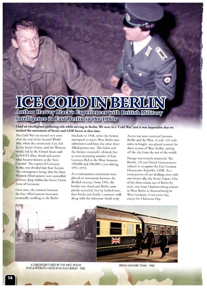
Cold War Berlin – February edition of Wargames Illustrated.
Below is the first page of a four page article on Cold War Berlin in the February edition of ‘Wargames Illustrated’. The magazine has the remaining three pages along with other interesting sections associated with modern warfare and wargaming.
.
.
I have recently written the first of two novels in my latest Apocalyptic series, ‘Force Majeure – Purgatory’ and ‘Force Majeure – Paralysis’. The third in the series will be out mid next year. Prior to these two books, I wrote a Cold War trilogy, The Red Effect, The Black Effect and The Blue Effect, portraying what I believe could have happened in the 1980’s, had the Soviets, and the Warsaw Pact, taken the decision to attack West Germany and plunged the world into a third world war.
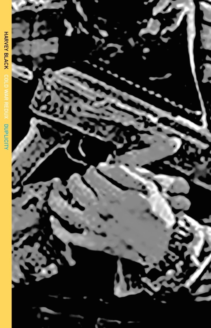
I now ask myself the question, are we heading down that very route now? To answer that, I am in the process of writing the first book in a new Cold War trilogy, or the ‘Cool War’ as it is sometimes referred to. The first draft title is ‘The Cold War – Redux (Duplicity)’.
.

Flag of Ukraine
There are two cover options being considered at the moment. Bearing in mind I am writing a trilogy, the cover chosen would have to evolve to reflect that. Publication is due in about 6 weeks time….
.

The first cover option shows the blooded handprint of the Russian Federation on the flag of Ukraine.
.
The second cover is more sinister, representing the conflict in Ukraine and beyond….
.
Site and content, including photographs, is copyrighted to Harvey Black.


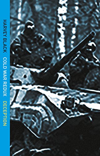


Both covers are effective, but in the second one (the darker one), I had to look harder to find the title and author and even then it was hard to read the part that says “Cold War Redux” (white font on yellow doesn’t show up well). I wonder how it would be with the title near the top of the dark cover?
Thanks Anneli. I will feed that back. What about the picture?
I like both ideas (the bloody hand) and the hands with the gun in the background. Could the dark cover be made a little bit easier to decipher? Maybe not so many gaps in the flow of the contour lines (the outside lines) of the images, to make it easier to make out what the images are. If that were fixed and the titles showed nicely on the front, I would go for that cover over the other. My main problem with the bloody hand cover is that the yellow and blue look too pretty for a war book. (Maybe a darker, mustardy yellow and a not-so-bluebird blue.) The hand is great and I got the image of blood right away. It’s a real chore to get the cover just right, isn’t it? But it will be worth the trouble in the end.
I agree with you. The first one is a bit too cartoon like, but that is the colour of the Ukrainian flag. I will get back to my publisher. 🙂
I am really looking forward to the Berlin article!
I rather like the first, second one is far more ‘striking’ however its a little harder to follow and look at. It seems a little harsh. If that makes sense…..
Hi Keith. Thank you. I agree with you, and have gone back to my publisher with the points raised. It is striking, but a little too blurry. Magazine is in the newsagents now. Enjoy.